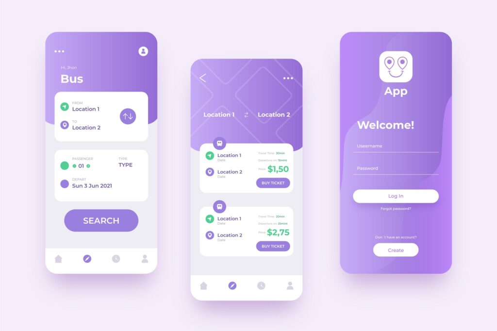
Effective navigation is the backbone of user experience (UX) for web and mobile applications. A seamless navigation design not only ensures users can find what they’re looking for but also enhances overall usability, reduces friction, and improves conversion rates. In this blog, we’ll explore strategies and best practices for designing intuitive navigation systems for both web and mobile platforms.
Why Navigation Matters
1. Enhances User Experience
Clear and intuitive navigation enables users to browse content effortlessly, reducing frustration and improving retention.
2. Supports User Goals
Navigation acts as a roadmap, guiding users to the desired information or action, whether it’s finding a product, completing a form, or accessing a service.
3. Boosts Engagement and Conversions
When users can easily navigate your site or app, they’re more likely to stay longer and interact with your content or features.
Key Principles of Seamless Navigation
1. Consistency Across Platforms
Ensure navigation elements are consistent across web and mobile versions of your app or site. This reduces the learning curve for users transitioning between devices.
2. Simplicity is Key
Avoid clutter by limiting navigation items to the essentials. Too many options can overwhelm users and lead to decision paralysis.
3. Prioritize Accessibility
Navigation should be usable by everyone, including users with disabilities. Use proper color contrast, keyboard navigation, and screen reader support.
4. Focus on Hierarchy
Structure navigation logically by grouping related items and using a clear hierarchy to help users find what they need quickly.
Types of Navigation Systems
1. Top Navigation
- Best for: Desktop websites with a broad range of categories.
- Examples: E-commerce sites like Amazon or news platforms.
- Tips:
- Include dropdowns for subcategories.
- Use sticky headers to keep navigation visible while scrolling.
2. Side Navigation
- Best for: Content-heavy sites and mobile apps.
- Examples: Dashboards like Google Drive.
- Tips:
- Keep the menu collapsible for cleaner layouts.
- Include icons alongside text for quick recognition.
3. Bottom Navigation
- Best for: Mobile apps with up to five primary actions.
- Examples: Social media apps like Instagram or WhatsApp.
- Tips:
- Use labels for clarity.
- Avoid overcrowding with too many items.
4. Hamburger Menus
- Best for: Apps or sites with limited space.
- Examples: Streaming services like Spotify.
- Tips:
- Ensure important items are visible or easy to access from the menu.
- Combine with gestures (e.g., swipe-to-open) for added usability.
5. Tab Navigation
- Best for: Apps requiring frequent switching between views.
- Examples: Banking apps like PayPal.
- Tips:
- Keep the number of tabs manageable (3–5).
- Highlight the active tab to show context.
Design Tips for Seamless Navigation
1. Use Visual Cues
- Highlight the current page or section with indicators like underlines, bold text, or color changes.
- Use breadcrumbs to show users where they are in the hierarchy.
2. Optimize for Touch and Click
- Ensure clickable or tappable elements are large enough for easy interaction (minimum 44×44 pixels).
- Leave sufficient spacing between elements to avoid accidental clicks.
3. Leverage Search Functionality
- For content-heavy sites and apps, include a search bar to help users find specific items quickly.
- Use auto-complete suggestions to enhance search usability.
4. Test Across Devices
- Ensure navigation works seamlessly across desktops, tablets, and smartphones.
- Test on different browsers and operating systems to identify potential issues.
Navigation for Mobile Apps: Unique Considerations
1. Prioritize Thumb-Friendly Design
- Place key navigation elements within reach of the user’s thumb, typically at the bottom of the screen.
2. Simplify Navigation Hierarchy
- Avoid deep hierarchies. Aim for flat navigation to minimize the number of steps needed to reach a destination.
3. Leverage Gestures
- Incorporate swipe gestures for common actions like navigating between pages or dismissing menus.
4. Offline Considerations
- Design navigation to function even when the app is offline, displaying cached content or placeholder messages.
Common Navigation Mistakes to Avoid
1. Overloading the Menu
Including too many links or categories can overwhelm users. Prioritize the most important items and group the rest logically.
2. Poor Labeling
Unclear or jargon-filled labels confuse users. Use plain language that aligns with your audience’s expectations.
3. Inconsistent Design
Navigation that looks or behaves differently across pages or platforms creates confusion. Maintain consistency for a seamless experience.
4. Ignoring User Feedback
Assume nothing! Regularly test your navigation with real users to identify pain points and make improvements.
Tools to Improve Navigation Design
- Heatmap Tools: Tools like Hotjar or Crazy Egg can show where users click most often, helping you optimize navigation placement.
- Usability Testing: Platforms like UserTesting or Maze provide insights into how users interact with your site or app.
- Prototyping Tools: Tools like Figma, Sketch, or Adobe XD allow you to create and test navigation designs before implementation.
Conclusion
Seamless navigation is a cornerstone of excellent web and mobile app design. By focusing on simplicity, accessibility, and user-centric principles, you can create navigation systems that guide users effortlessly while enhancing their overall experience.
Start with user testing, iterate based on feedback, and ensure your navigation design is consistent, functional, and delightful. Whether you’re building for web or mobile, great navigation paves the way for happy users and business success.
Devoq Design is a premier UI/UX design agency with a strong presence in both Tweed Heads and Coffs Harbour. Renowned for their innovative and user-centric approach, Devoq Design specializes in creating seamless and engaging digital experiences. As a leading UI/UX Design Agency in Tweed Heads, they cater to a diverse range of industries, ensuring each project is tailored to meet the specific needs of their clients. Similarly, as a top UI/UX Design Agency in Coffs Harbour, Devoq Design combines cutting-edge technology with creative expertise to deliver exceptional results that drive business growth and user satisfaction.


